Extract UI Items
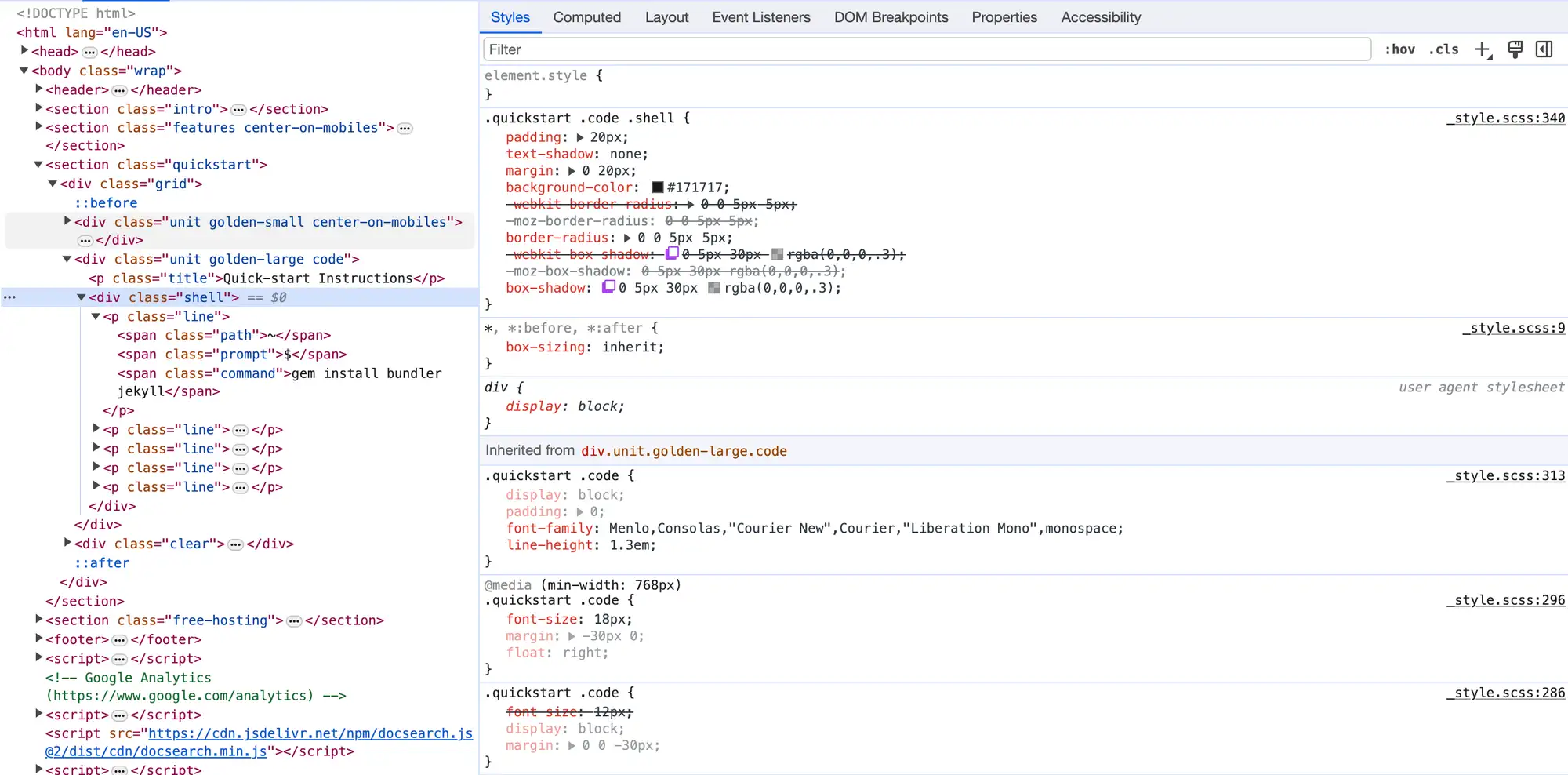
Quick-Start Instructions Box
User Interface Discussion
I like this UI Item because it is a text box formatted to look like a few lines of code within a console or terminal window. It allows users to copy and paste the code, where an image would not allow this. Changing the colors of certain parts of the code also helps to differentiate them.
The "window" is contained within one div of class "unit golden-large code", the title ("Quick-start Instructions") is contained within a paragraph of class "title", and the text box is contained within div of class "shell". The title is colored with a gradient; a border radius on the top right and left corners combined with a border radius on the bottom corners of the text box makes the two separate elements read as one "window"; a white text-shadow behind the title aids the readability against the gray background. The body of the text box has a dark background color applied to it; the font is selected by a CSS property applied to the "code" class within "quickstart", a section element which also contains the "Get up and running in seconds." text to the left of the text box. Lastly, each line of code displayed in the textbox resides in a paragraph element of class "line", which itself contains span elements with different class values that alter individual parts of each line to make them appear with different colors.
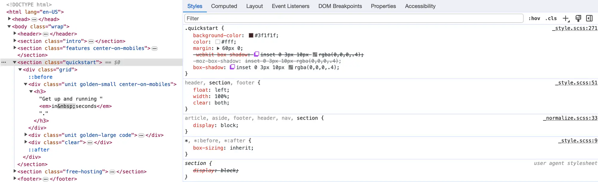
Quick-Start Stripe
User Interface Discussion
I like this UI item because it draws attention directly to the middle of the page without being overly flashy. The use of an emboss-like effect and shadow are subtle and visually appealing. I also like how it clearly separates the page into 2 distinct sections.
The dark red background color is applied to "quickstart", as is the white font color and margins separating the entire section from the content above and below. A very subtle box shadow is also applied here. Within "quickstart" is a div of class "grid" which contains a CSS rule for auto margin and a max-width of 978px that keeps the quickstart section from taking up the whole width of the screen. Insdie "grid" is a div of class "unit golden-small center-on-mobiles" which gives the content a padding of 20px, and finally there is an h3 which contains the text, sets a 50px top margin, and centers the text within its layout on the grid.
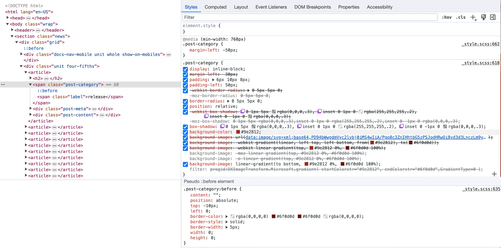
News Page Release Ribbons
User Interface Discussion
I like this UI item because it appears like a ribbon that wraps around the back of the page. It's visually appealing and gives the website a sense of depth that would be missing if it were just a red bubble. I also like that although the ribbon itself is offset to the left, the text within each ribbon is still alligned with the text of the release update below it.
Each post on the News page is contained within it own article element; inside is an h2 containing the title and a span of class "post-category" which contains the ribbon. A CSS rule applied here sets the left margin at -50px, which pushes it to the edge of the wrapper; another rule sets a dark red gradient as the background. Inside the span is a ::before pseudo-element which styles the small triangle that "wraps" around the back of the wrapper. A 5px border is applied and colored a darker red than the rest of the ribbon, and absolute positioning is used to make it appear above the ribbon and just to the left of the wrapper.
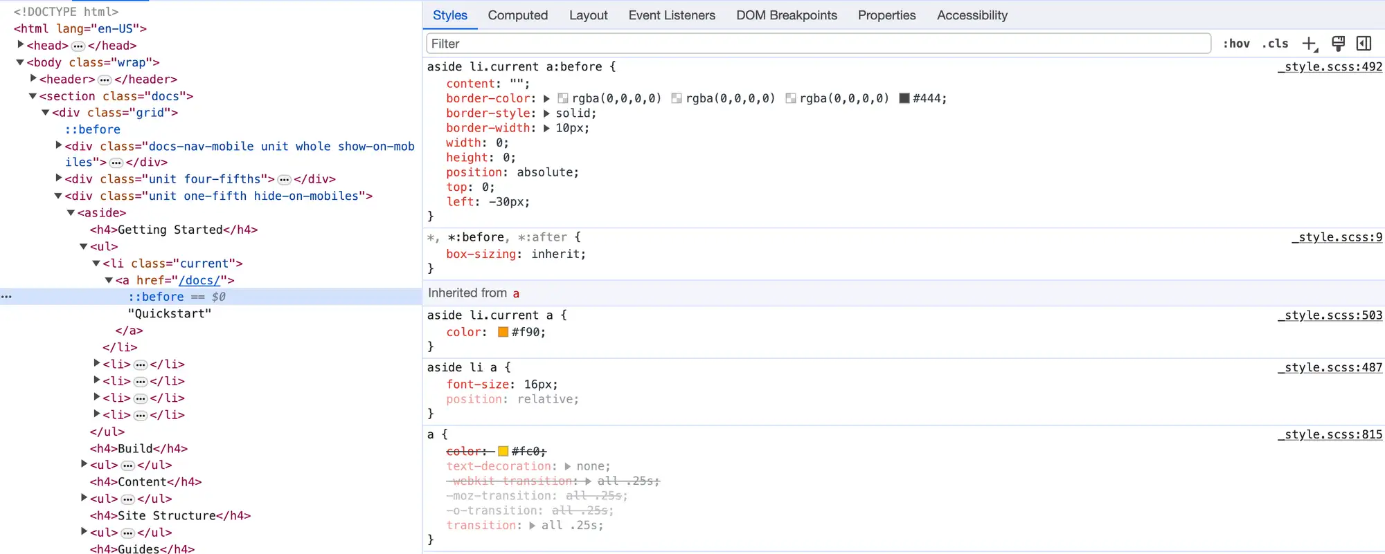
News Page Navigation Arrow
User Interface Discussion
I like this UI item because it is a clear and effective way to show which page is currently being viewed that is distinct from the main navigation which uses a yellow box to display the current page. This is especially helpful considering there are many links under "Other News" that are all yellow and not the easiest to distinguish from each other.
The navigation box is coded as a ul, with the li pertaining to the current page given a class of "current". The links are made to appear yellow, with the link for the page currently being viewed displayed as orange. A ::before pseudo-element is coded with a border color on the left side, which makes it display as a gray triangle. The rule is applied to "aside li.current a:before" which appears to make it display alongisde whichever li is given the class "current".