Code
While the code for this page appeared very readable through Chrome's developer tools, the source code page utilized no indentation, separation of elements, or really anything to make the code readable for humans. The entire home page only contains 28 lines of code, but almost every line is massively long. The first line, which contains the majority of the content on the page, is comprised of 29,131 characters (2,306 words). Attempting to read the source code page is practically useless, and I had to rely entirely on the dev tools to pick apart the code. Despite this, I did appreciate the use of logical id and class names, as well as very descriptive alt text. This made it easier to see how the opening animation was coded. Each part of the illustration is contained in its own div/layer and is titled accordingly (layer foreground, layer midground, layer background, etc.), and upon opening the web page they all scroll in from the bottom and sides to make one complete illustration.
UI
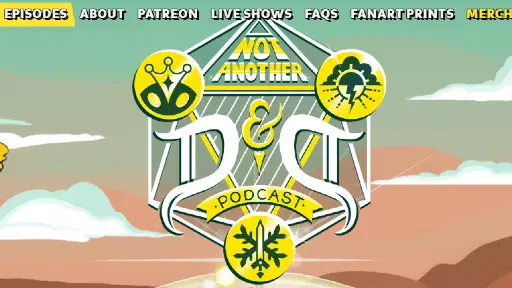
The site's UI is very intuitive and user-friendly. The nav bar remains static at the top of the page, and gains a dark background once a user scrolls past the illustration section to maintain readability. Additionally, the navigation links are all white, apart from the Merch link, which is yellow. This is a simple way to indicate that this links to a separate Store page (shop.naddpod.com), while the rest of the links are internal links. The Podcast logo on the left of the nav bar is also a link back to the home page. The nav bar links all gain a yellow background when hovered over, while other home page links change from yellow and black to white and green, matching the background colors behind the "Meet the Cast" and "Fanart Prints" sections. Each section of the home page also contains links to each of the pages linked to in the nav bar (with the exception of FAQs). Some other features of the UI I appreciated are a toggle switch on the Episodes page which allows the user to sort episodes by Newest to Oldest or vice versa, as well as a drop-down menu which separates episodes into the different campaigns or categories they were featured in.
UX
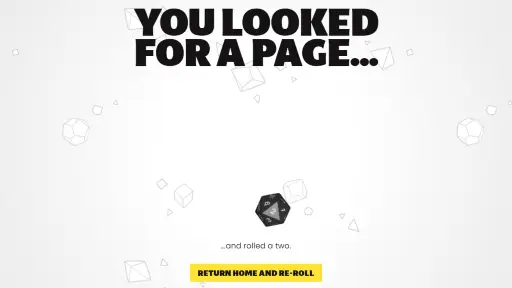
I find the user experience of this page to be very fun and satisfying. The opening animation is an exciting way to enter a website, and the artwork and styling is immediately appealing and engaging. The background below the opening illustration is a composite of two repeating patterns of dice and geometric shapes that move diagonally towards each other when the page is scrolled, creating a cool 3D-esque effect. The consistent color palette of yellow, green, and white helps give the site a unified theme. The home page sections for their "Meet the Cast" page, merch store, and fanart store display intricate and detailed artwork which I also found to be visually appealing. A mobile-only feature I really enjoyed is displaying the hidden navigation menu as a 20-sided die, which "rolls" across the page when clicked on to reveal the menu. Another feature I appreciated is their 404 error page, which displays an animation of a 20-sided die rolling a 2 alongside a message stating "You looked for a page...and rolled a two." Their comedic tone across the various pages of the website does a good job of showcasing the humor they demonstrate on their podcast, and overall their website is an excellent display of the tone, aesthetic, and appeal of their show.
Summary
Despite this site's unorganized code and sitemap errors, this is a very visually appealing, engaging, and exciting web page. It does a great job of drawing in users who may be unfamiliar with the podcast and demonstrating the creators' creative sensibilities. It is formatted well for mobile, the color scheme is consistent and appealing, and the artwork and At the bottom of the page, there is a link to the home page for Jeff Carbine, the developer who created this site. Upon browsing through his site, I saw Jeff specializes in web pages for other Dungeons and Dragons podcasts. I suspect he uses a program to create his code, as his other pages have similarly long lines of code. However, his creative style is very creative and consistent across each page, despite each page having their own aesthetic and vibe. I am unsure if he creates the art for each web page, but even if he is only responsible for the page layouts, he does a very good job of making everything accessible, functional, and intuitive.