Code
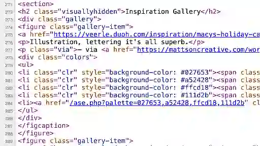
I liked how the Inspiration Gallery looked, and was curious about how she displayed the color palette circles below each image. Upon inspecting the code, I saw that the entire gallery was contained within a div of class "gallery", with the individual images and color palettes listed within figures of class "gallery-item". Each gallery-item contains an unordered list containing list items of class "clr" which contain the color circles. A display: flex has been applied to the ul, alongside a justify-content: center to center the circles below each image. The circles themselves are span elements of class "clr-value" with a border-radius of 50%, while the colors are applied via inline styling for each individual circle. The fifth circle is a download link for a .ase (Adobe Swatch Exchange) file containing the color palette.
UI
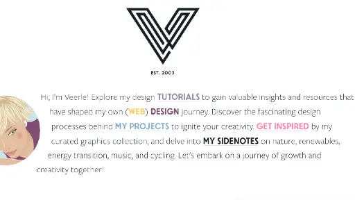
At first I didn't love how the different links in this paragraph were different colors, but I found that they all link to different pages of her website that are also accessible via the Navigation bar. The colors match with the color scheme for each individual page. I appreciated having theses different areas accessible through different means, and while on each page, the navigation link for that page changes color to make it clear which page the user is currently on.
UX
Initially, I found the amount of colors Veerle used to be a bit visually overwhelming, but once I went through the rest of the site's pages, I realized the main color palette she uses is actually very consistent, especially considering her entire Inspiration page is devoted to different color palettes. When the page first loads, a simple animation of 8 colored circles displays, which then merge into one circle and trace the outline of the "V" that makes up her logo. These 8 colors are the main colors she uses throughout the site. The website is easy to navigate and visually appealing, and I found the experience of navigating through her different pages to be enjoyable.
Summary
While I didn't immediately love the look of this site due to the amount of different colors used, I found it to be actually quite aesthetically pleasing once I delved deeper into it. I'm not a huge fan of some of the art she displays, as it reminds me of corporate advertising, but I do like the background graphics she use, as they are simple and fun and do a great job of portraying the vibe she was going for. I find her website to be overall very nice to look at and navigate, and I will likely return to this site if I am seeking inspiration or graphic design advice.